
Post by Caroline Nickerson. Art by Olivia Zhang.
The Ecological Society of America's Rocky Mountain Chapter, first established in 1982, has long connected ecologists across universities, tribes, and agencies from New Mexico to the Yukon. The people behind this chapter are tasked with understanding and managing the region's mountain and plains systems.
Colorado State University’s Natural Resource Ecology Laboratory (NREL) plays a role: NREL scientists Jill Baron and Dennis Ojima, both past ESA presidents, are helping lead the chapter, continuing a long tradition of NREL research on how the region's mountain and plains ecosystems respond to change.
This team needed a banner for its table at the ESA Annual Meeting, held July 26 to 31 in Salt Lake City. They asked me to help, and in turn I asked artist Olivia Zhang to make it with me. The banner shows a Rocky Mountain landscape, and the line across the top is real temperature data for the region.
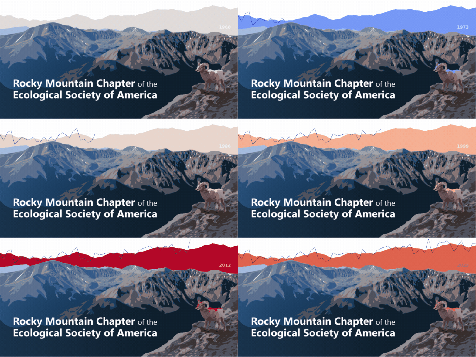
We invite you to download the banner as a high-quality GIF and share it with your networks!
About the Banner
The line across the top of the banner is the part worth explaining. It is the annual mean temperature for the Rocky Mountain National Park region, from the PRISM climate dataset made by the PRISM Climate Group at Oregon State University.
In the animated version of the banner, the graph changes color as it warms over time.
One note on the data: PRISM's own documentation says graphing century-long trends with its monthly data should be done carefully, because of station moves, network changes, and differences in how observations were taken.
We use the line as an illustration, and the color fill shows the rolling 5-year average to capture long-tern trends (as done by the NPS).
The warming demonstrated by the animation lines up with what NREL and USGS researchers, including Baron's Loch Vale record, have found for the region using other data.
Why Data + Art?
A chart takes some effort to read. A picture does not. Putting the temperature record where the sky would be lets people see the trend right away. The point is not just to show numbers, but to give people an easy way to start understanding temperature and climate change.
Implications of Warming
Warming in the mountains has real effects. It changes snowpack and the timing of snowmelt, which affects water supplies downstream. It puts stress on alpine species like the bighorn sheep in the banner. And it changes the ecosystems that theRocky Mountain Chapter's members study and manage.
Water, wildlife, and human demand are all connected across this region, and working across those areas is what the Rocky Mountain Chapter is being rebuilt to do.
The banner will be on the chapter's table at the ESA Annual Meeting in Salt Lake City in July. Stop by the table and say hello!
Art by Olivia Zhang. Temperature data from the PRISM Climate Group, Oregon State University. Banner produced for the ESA Rocky Mountain Chapter.
Caroline Nickerson is a communications specialist at NREL.